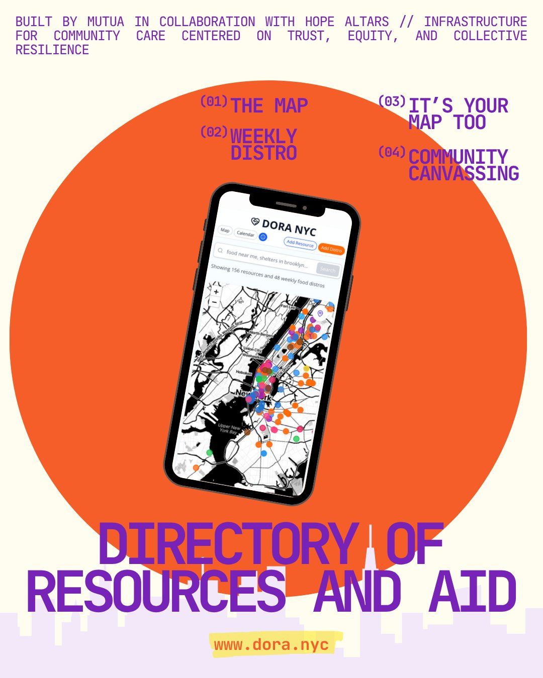
A mutual aid map for New Yorkers
In the spring of 2025, mutua.nyc (a fiscally-sponsored mutual aid project I founded focused on crisis response infrastructure) began making a mutual aid map for New York City. We collected a spreadsheet of resources, and I began coding up the map. Not much later, a community organizer and designer reached out about a similar idea—a group of activists were thinking about creating a resource map for New York, and given my experience with FireAid, they were wondering if I could provide some technical advising. We chatted. Our alignment was remarkable. So in further conversations, I offered to join as a technical contributor to help design and build the map that would become dora.nyc: the NYC Directory of Resources + Aid.
Now that the site has been live for about a week, I wanted to pause to reflect on the design process, our plans for the map moving forward, and mutua’s evolving role as an org that creates mutual aid infrastructure and researches the very same. Specifically, how can mutua use its experiences of building crisis infrastructure and mutual aid maps to create durable research that might help others wishing to create such a system for their communities. This requires considering both design strategies (like participatory design) but also the risks of creating heightened visibility in the grassroots mutual aid system of a major metropolitan area. In this sense, this article is a first step towards documenting how the map was made and some questions and lessons from building it.
Dora’s Design Evolution
Phase 1: Prototyping
We started with creating a basic map interface, that pulls from a Google Sheet. That way we could easily begin researching addresses, geocoding, and getting them on the map. We decided to use the spreadsheet as our data store, as it can be easily edited, no overhead costs for a database subscription, and the row-column format of spreadsheets fit well with the kind of per-resource data we were initially trying to collect. That said, if we were to scale up the map to other cities, or even thousands of rows—migrating to a database could make sense. But in the spirit of building an MVP that could be easily edited, that has simple access controls and transparency, a spreadsheet fit our needs for now.
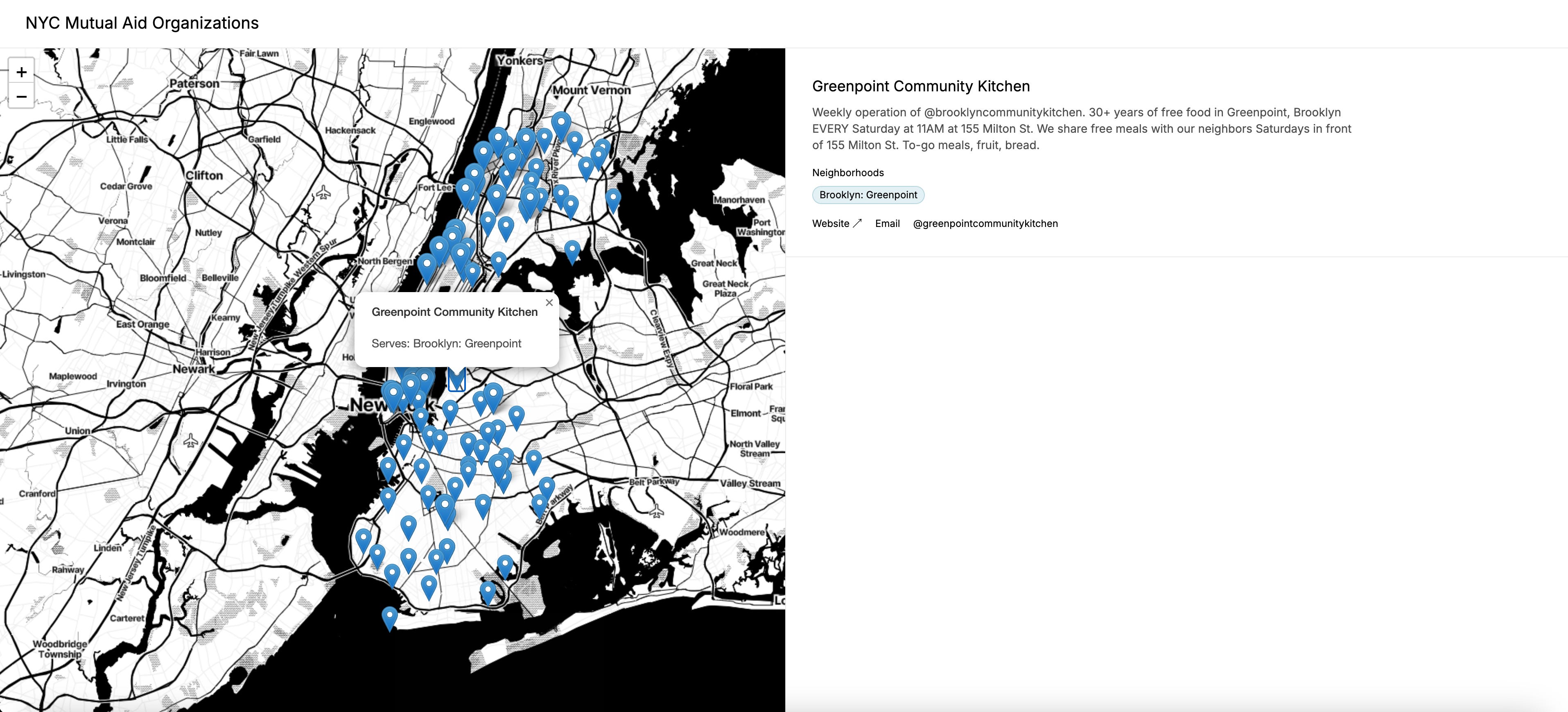
Building on a similar interface as FireAid, I decided to preserve the Stadia Maps Toner basemap. This is an elegantly designed, monochrome basemap that works well for urban territories—color is foregone for traced detail of streets and buildings. I coded up a simple interface that would allow us to visualize the map side by side with selected resource details, like this:
The process for data entry remained relatively manual. We’d enter the resources directly into the Sheet and then I wrote a script to geocode them (a process that translates addresses to lat/lng coordinates, which the map needs for placing the pins) when the map loads. This would be a costly and slow approach, to geocode from scratch on each load, but worked for the purposes of a proof of concept.
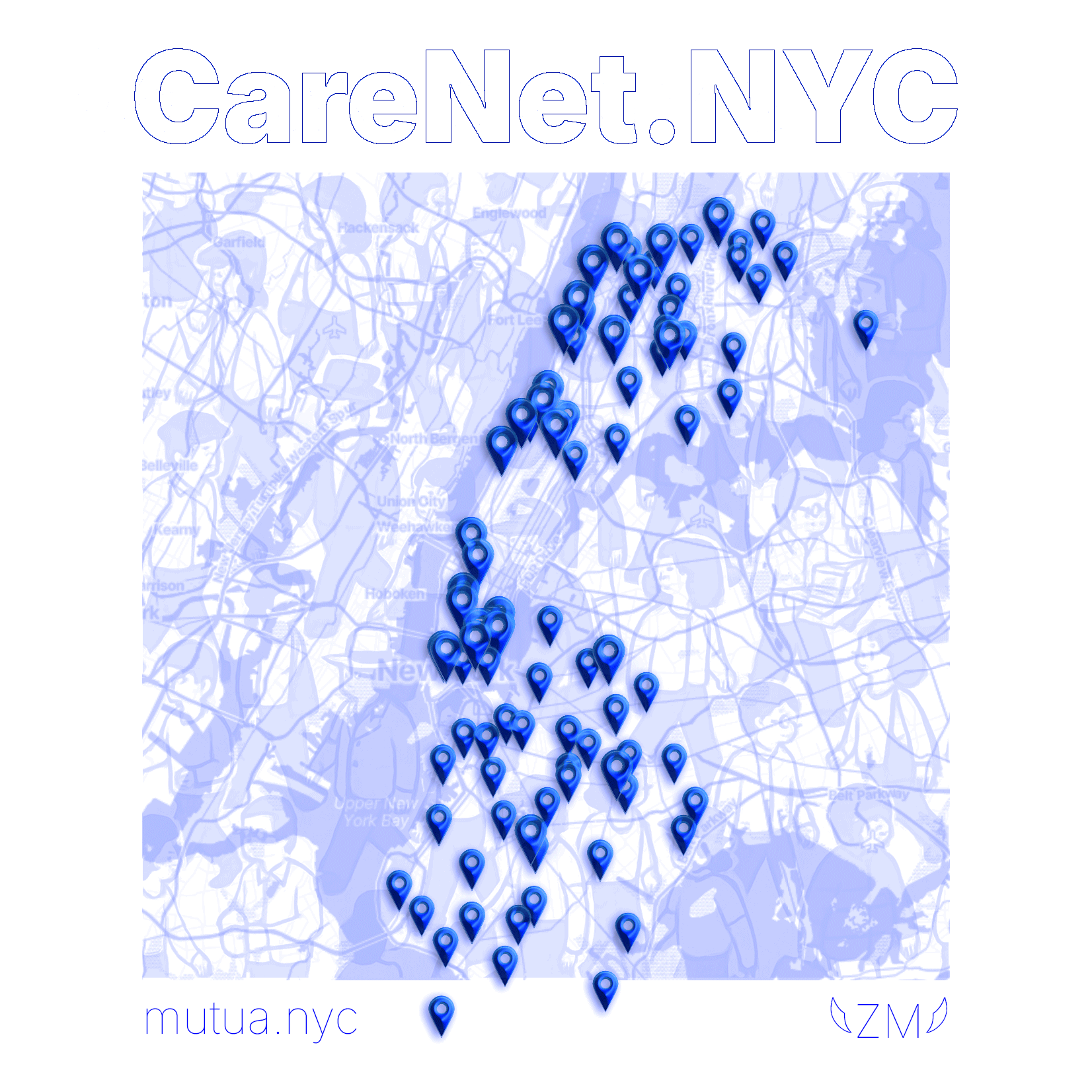
At the time we thought of calling it CareNet.NYC. We were still pretty far off from having a robust system, and were even thinking about community partnerships that could help us situate it in New York’s multifaceted mutual aid community. This was about as far as we made it, before teaming up with Hope Altars and the organizer group chat.
Phase 2: Forms and maps
We started collaborating in the summer of 2025. I decided to re-build the site from the ground up, with a few key design and implementation decisions:
Forms for data entry, that would allow us to validate and geocode addresses when the user inputs them. This would allow us to store the coordinates, and not need to make API calls every time the map loads. This wasn’t possible with FireAid, because I didn’t have write access to the source sheet, but this time we could build it from the ground up, making such an integration possible.
Google Sheets for storing resource metadata. This included attributes like the resource name and ID, but also descriptive information like what they’re accepting, providing and needing in volunteer capacity. We also stored social media and website links and of course the coordinates.
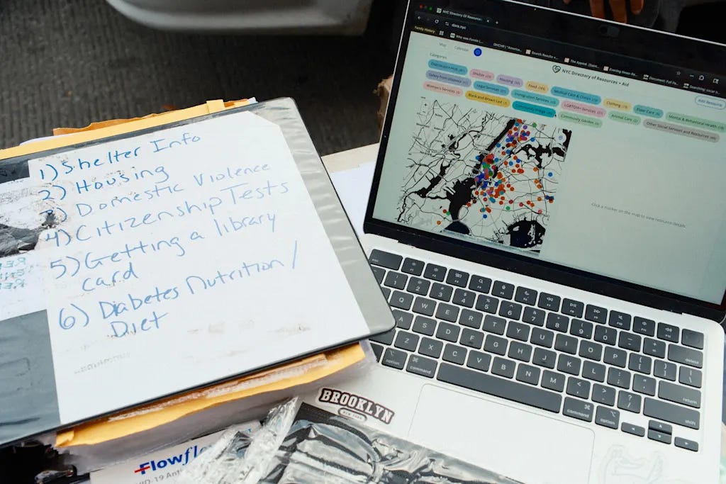
A comprehensive list of categories. This was a bit of a moving target that we iterated over a few months. You can see the full category list in the screenshot below. Hope Altars’ contributions to curating the categories was invaluable, as they had deep familiarity with the mutual aid landscape of New York.
Curiously, we started with implementing the forms. This would allow us to get ahead on sourcing resource data for the map. This is what the final resource form looks like (to date):
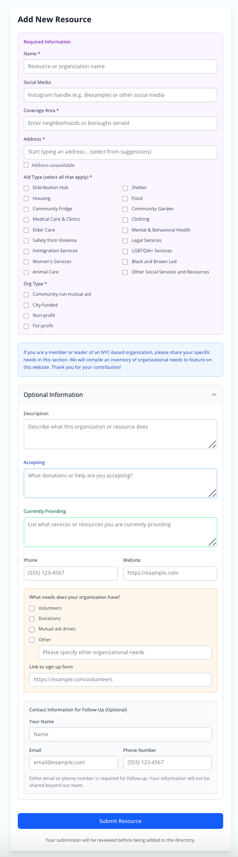
Note, it has both required and optional sections. This gives us some flexibility with both quick entry, that can get many resources up on the map fast, and more detailed information that would allow a user of the map to have a better sense of needs and offerings of the resource are.
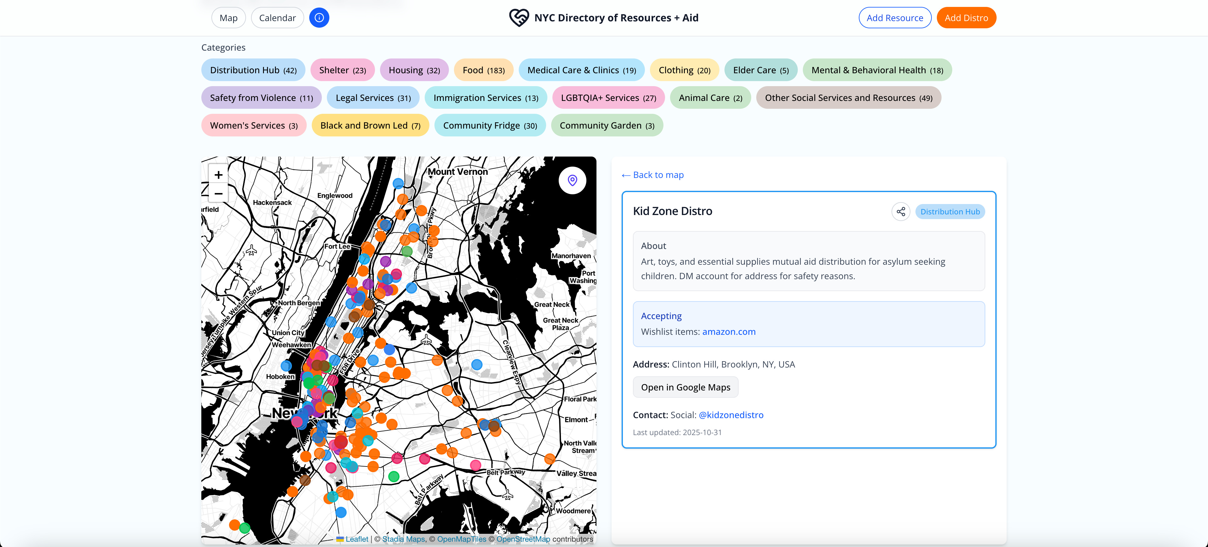
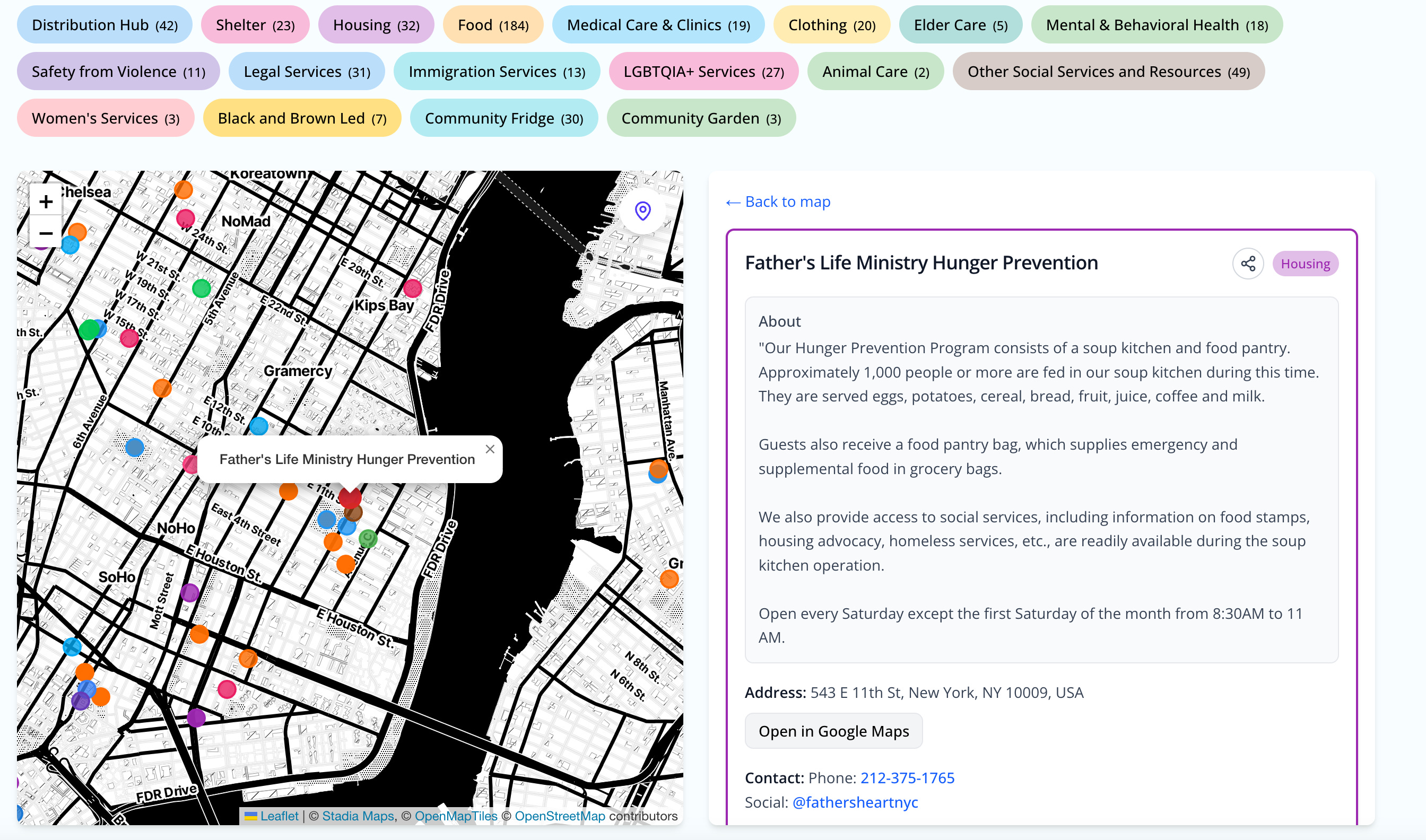
We went to work entering resource data, and with this I could move ahead and start building out the map interface. On desktop, we went with a similar approach to FireAid—the map and resource card side by side, category pills for filtering, and a header to quickly access the forms.
With this all in place, I could color code the map’s markers and category pills, create a simple filtering algorithm, and fine tune the map-card interactions.
This is what the interface looks like today:
Hope Altars recruited volunteers to enter more resources into the map. Drawing on the NYC Resource Library’s spreadsheets and Google Docs, we were able to add dozens of resources across the five boroughs.
Phase 3: SNAP shutdown, distros, and a calendar
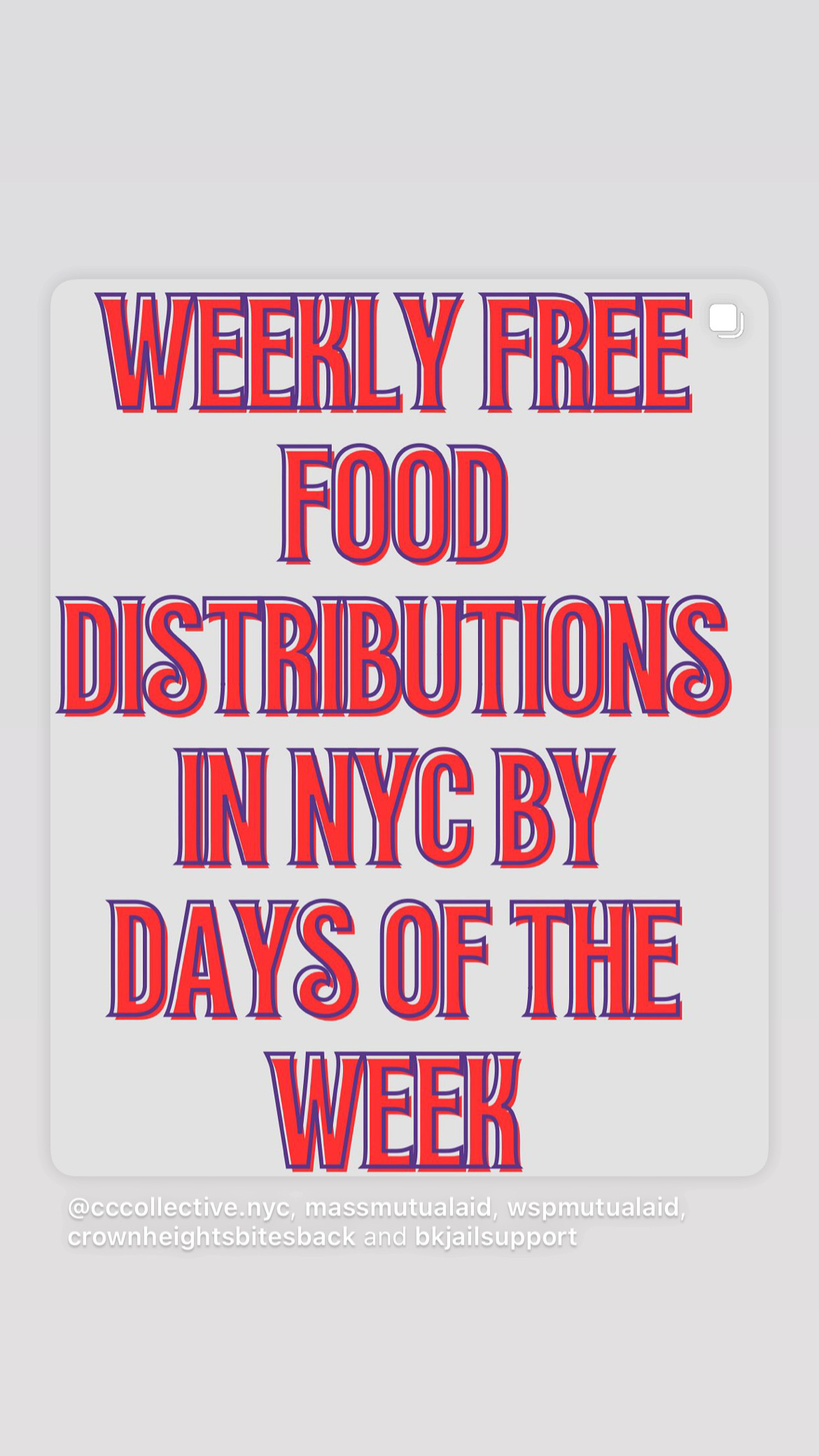
In November 2025 the federal government was shut down, and it came to our attention that SNAP benefits might be suspended. Over a million New Yorkers rely on the SNAP benefits to feed themselves and their families. Immediately on Instagram flyers started circling with weekly food distros. They were organized by day of the week, with offerings across all 5 boroughs. It made me realize that we should organize our directory by both space and time—in other words, a calendar was needed.
I explored several options (like Google Calendar integration) but we ultimately landed on rolling our own: the Distro Calendar.
I created a new add distro form, first with weekly time series, and later the ability to enter weekly (e.g. Fridays at 9am), monthly (3rd Thursday, 3:30pm) and one-off events (11/19/25 6pm). I built the calendar to show the current week’s activities, highlighted the current day, and integrated it with the map:
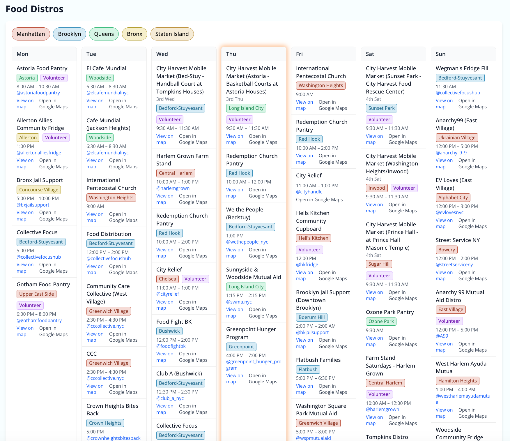
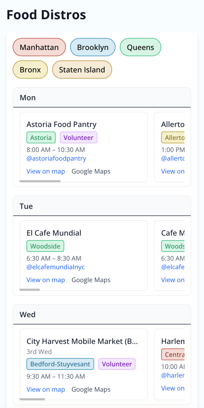
In order to color code it by borough and show the neighborhood associated with the address of the distro, I built a backfilling script that would look up the address and update the spreadsheet with borough and neighborhood metadata. I also created a secondary, mobile version of the map in a vertical format that naturally fits on the phone screen:
I combed through various social media posts to enter the food distros into the calendar. It was very satisfying to fill in, and this seemed to be the final cornerstone in the directory.
I then optimized the map for mobile, added an AI-powered search feature, and various other details like an About page and navigation buttons. The AI-search uses a small LLM to parse search queries and translate it into category filters and location data that can adjust the map’s focus. This allows users to search intuitively in natural language, such zip codes, addresses, and specific needs like (“I’m hungry”, which would lead to Food and Distribution Hubs; or “I’m cold in Bed Stuy” which would show clothing and shelter resources in Bed-Study).
At this point, the SNAP shutdown was urgent, and we had a thoughtfully designed proof of concept and about 200 resources and distros. We decided to launch.
Phase 4: Launch
On November 8th, we released a post on Instagram and Twitter designed by Hope Altars.
It did well on both platforms. In the next two days, a surge of traffic pulsed through the site. Thousands visited it, community orgs started contributing their resources to the map, and we saw the post spread through the network. Yet it left us with the lingering question—will it stay purely in virtual space or reach the people, on the ground, who might benefit from it most?
Phase 5: Community canvassing
The five-phase design narrative (prototyping, forms, SNAP shutdown, launch, canvassing) is the corpus's most detailed account of praxis. It develops the 'cartography of care' from metaphor (in 'Network Theory of Care') to technical documentation, grounding the theoretical in the specific.
With Dora circulating online, we also put out a call for community canvassers to volunteer their time to bring flyers to the distro, collected up to date information on their status, and begin converting the map from a purely digital resource to something that exists on the ground and with the community members that can use it to help alleviate the stress of finding food and resources. This part of the initiative is led by Hope Altars. We built a canvassing form to solicit volunteers and continued to get the word out. At date, they’re in the process of training the canvassers and will start visiting distros next week. Having this on-the-ground community engagement will help us understand the state of play at local distros, how the map’s being used, and ways to optimize the UX, especially for those using the map on older phones or dark screens outdoors.
Reflections: From crisis to chronic aid
Drawing upon lessons learned from Los Angeles and the FireAid map, I’ve come to see how mutual aid maps can form a “cartography of care”—visualizing the latent goodwill of neighbors helping neighbors. This becomes particularly pronounced in times of acute crisis (like a flood, hurricane, or fire), when there is vast, focused interest on helping the affected population. What about when building infrastructure for a “chronic” crisis like the slow burning affordability crisis, food justice crisis, or even the nationally diffuse SNAP shutdown that represents long-standing instabilities in governance and slow burning national debates about welfare benefits?
For FireAid, decommissioning became obvious when the LA mutual aid group stopped updating the main spreadsheet that was being ingested by the map. Other aid groups had stepped up more substantively, and they made the call to transition to another infrastructure (an AirTable directory)—so the initial needs that filled the map’s conception were no longer as relevant. But what about the eventual integration or obsolescence paths that Dora might have?
The question 'under what conditions does Dora render its own obsolescence?' echoes the self-limiting logic of good infrastructure: the best mutual aid system is one that creates the conditions for its own unnecessary-ness. This connects to the Half-Earth vision in 'California Dreamin' -- restoration that renders intervention obsolete.
In some ways Dora is a remedial technology—something that relates to my research in palliative systems—it doesn’t seek to address the underlying conditions that might abolish hunger directly, but rather creates the conditions for care to flow more directly, create solidarity through visibility, and thus while mutual aid should address the underlying conditions that create the kinds of needs that Dora serves, it also operates on a seemingly indefinite horizon that makes the decommissioning question more slippery—under what conditions does Dora render it’s own obsolescence? What kind of governance should be in place to manage a system like this? And does it risk becoming a “pillar” in New York’s aid system without itself creating the conditions to cure the chronic crises it aims to intervene upon?
It struck me, not long after we released the map that our simple prototype, if sufficiently “successful” could risk becoming a pillar in New York’s food distribution system for the most vulnerable. If thousands of people start coming to this site daily to find food and aid, we’d suddenly hold certain commitments towards them: fresh data, a robust, functioning site, and so on. It struck me that this was a significant responsibility to carry, with long-term implications for the funding and maintenance and ongoing updating of the site. How should a site that’s becoming a kind of “resource commons” be governed? Is there a succession plan if I become side tracked or unavailable, as the core technical contributor and maintainer? While important questions, they remain unresolved. In part traffic is sufficiently slow that I don’t think we’ve reached such “pillar” status (yet) and we’ve also agreed to develop the map as a 6-month pilot project, which gives us some time to think about the longer horizons of the system and the kind of governance and funding we’d want for it moving forward.
The concern that Dora could 'risk becoming a pillar in New York's food distribution system' without curing the underlying crisis makes explicit what was implicit in every infrastructure text: the danger that palliative systems become permanent, that the map becomes the territory.
What’s next?
As the canvassing operation spins up, we’re thinking about what’s next in the short and long term. Building canvassing capacity will take time, however it may provide useful insights about how the map’s being used, and how that can further improve its design. This reflects a community-based participatory design approach, engaging the community members and people the map servers to create something that can continue to provide clarity and direction. We’re weighing running Dora as a 6-month pilot study, and then reassess whether to keep it as a longer-term resource, sunset, or some kind of exit-to-community transition.
During this pilot period, I want to use mutua as a vehicle for better understanding how mutual aid maps act as an intervention in the community, and produce some outputs (likely in the form of whitepapers or reports) that could inform other organizations who wish to conduct such a project. Indeed, we’ve already heard from activists in Philly, Chicago, Houston, and New Jersey about whether we could support their cities—and while Dora could feasibly be extended to expand to other locales, there are also some known/unknown risks in providing this information that I want to understand better before scaling up. For instance, could malicious actors put nodes on the map? Or how does the vetting process/training scale with other cities? Perhaps the way forward is not just to expand the map—that could happen—but to create durable research outputs that help others do projects like this in ways that are locally suited to their own localities.
For mutua, this means a bit of a transition—from crisis-based interventions and infrastructure provision, to also using its existing infrastructure as a research site for improving its understanding of mutual-aid-infrastructure-as-intervention. Methodologically, this might mean both aggregating quantitative data about the map’s performance, but also qualitative ethnographic interviewing of direct and indirect stakeholders, from those using the map to find food as well as people working in distro and so on.
For now what we know is Dora has already enjoyed thousands of people who’ve visited the site. Now that the launch hype has died off, it’s seeing around ~200 daily visitors. Daily visitors can be a key quantitative indicator of impact, but really it will be the stories we gather from the distro that paint a fuller picture of how our system is serving New Yorkers.